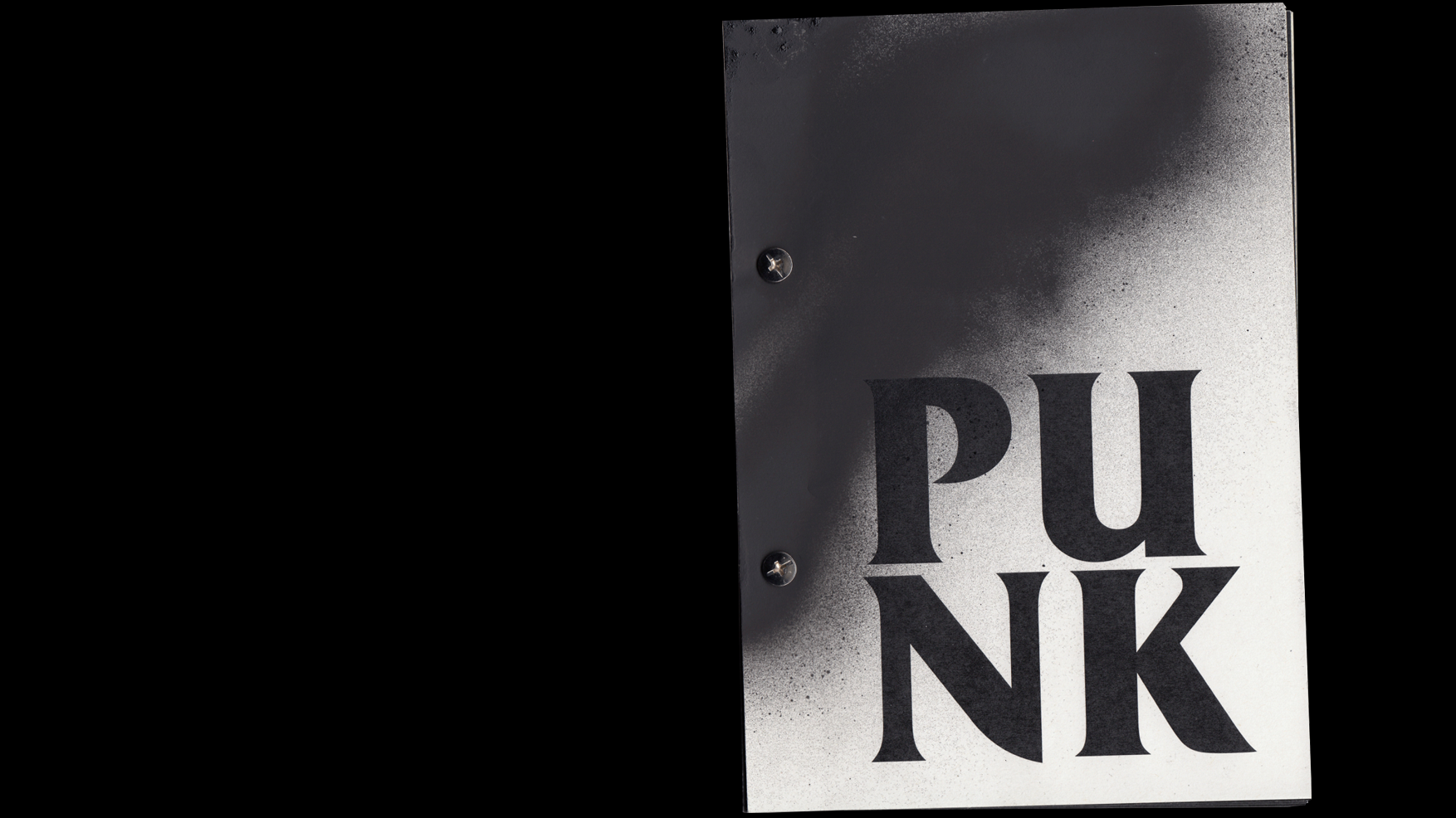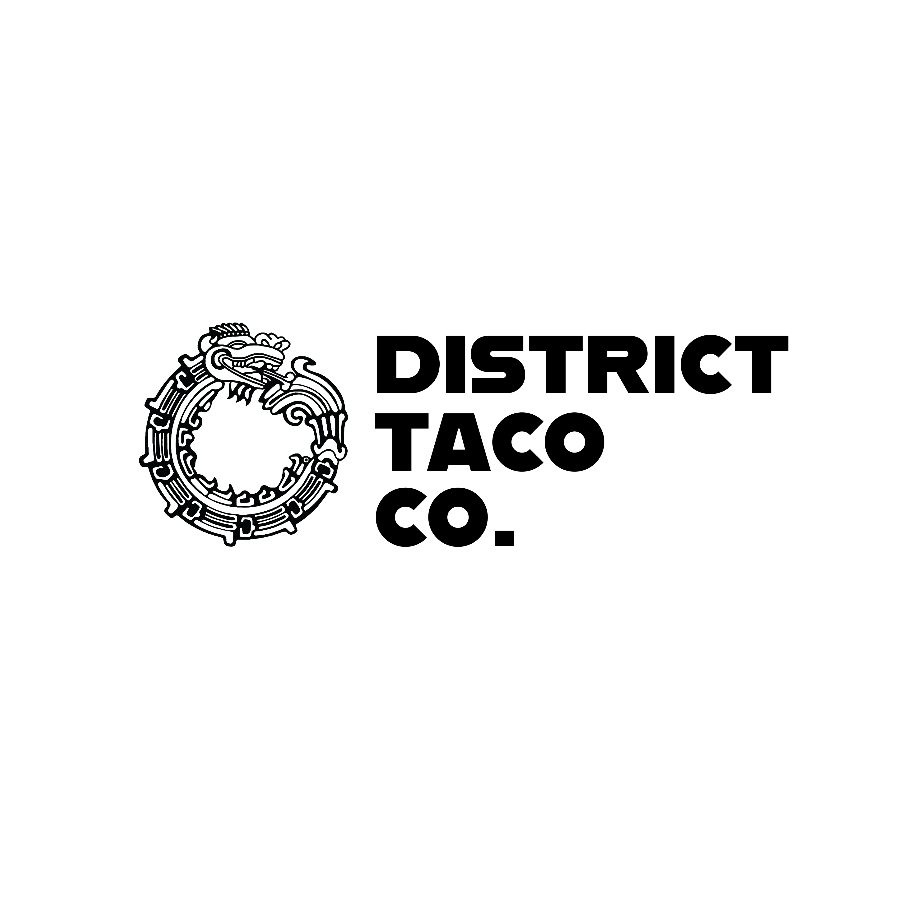
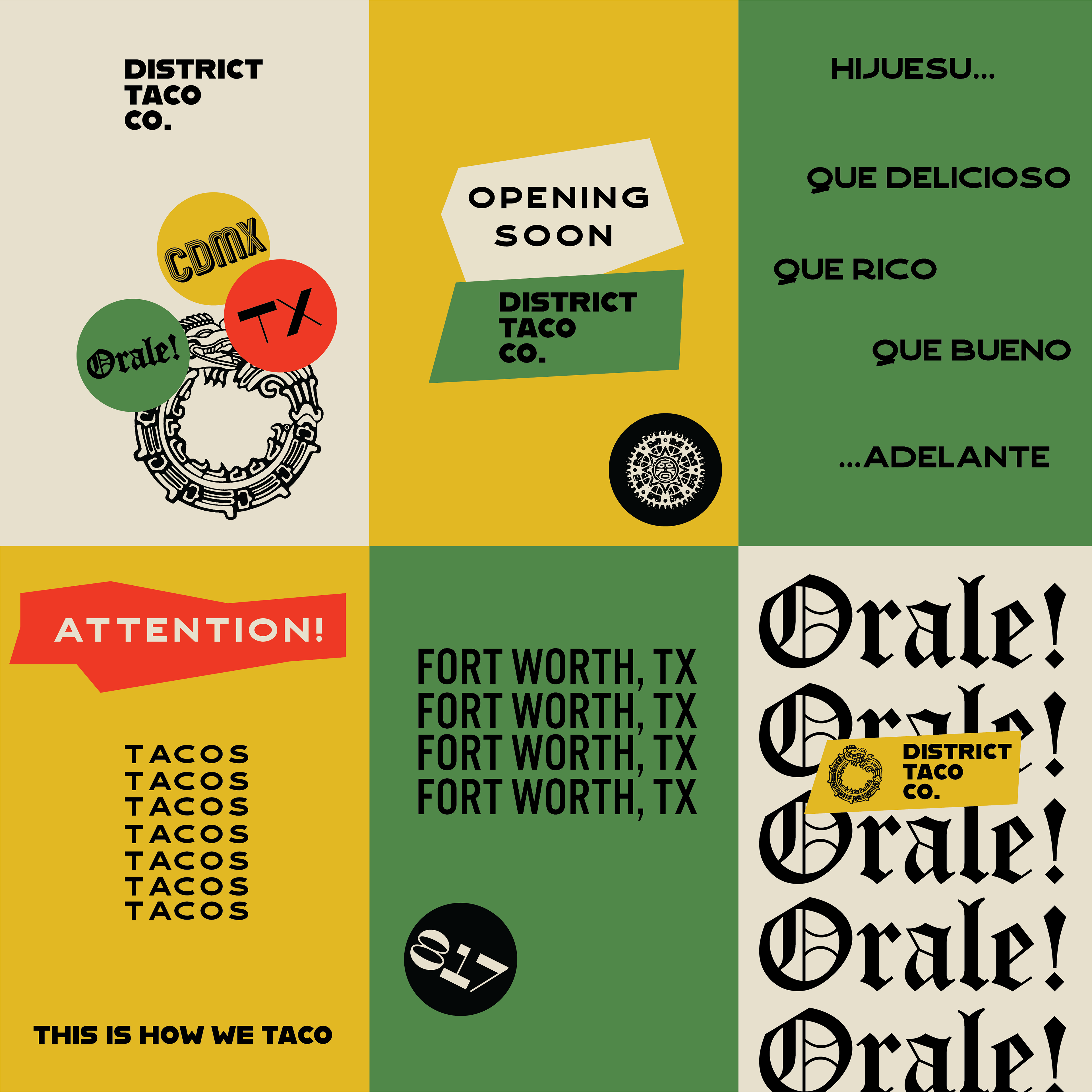
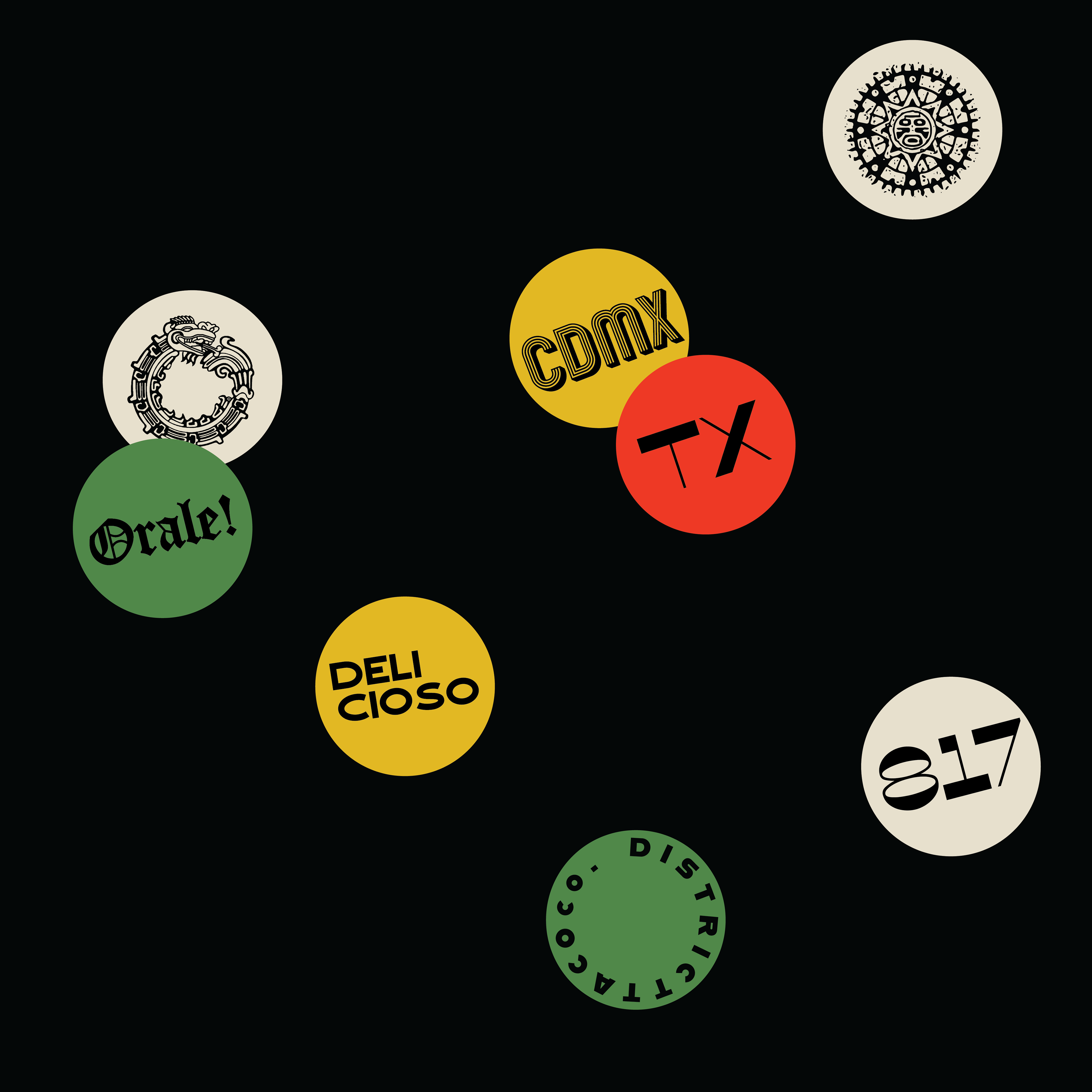
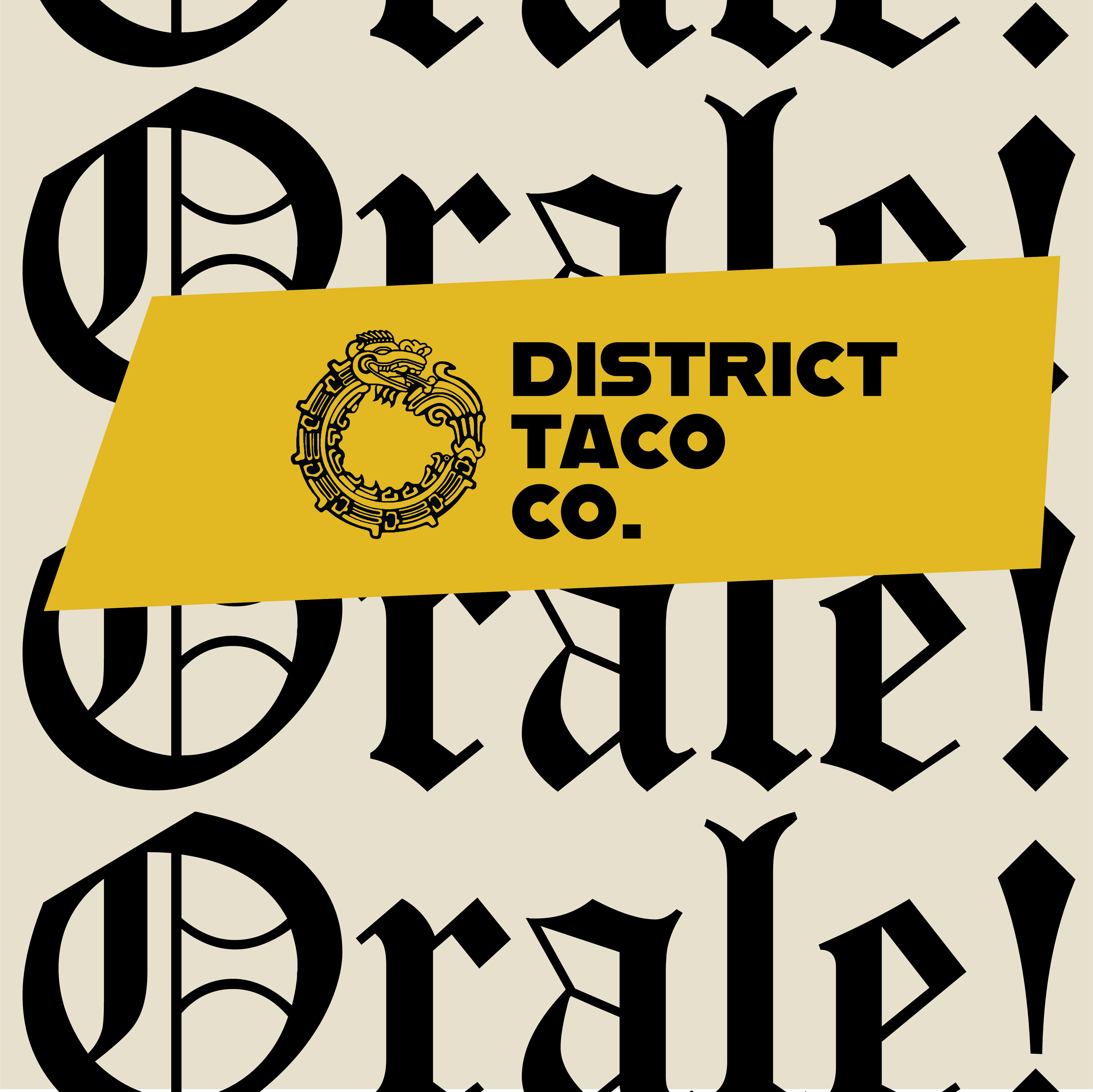


District Taco Co. is a bold new taco truck concept set to hit the streets of Fort Worth, TX, with a mission to reinvent the taco experience. By blending non-traditional ingredients, the brand celebrates the fusion of Mexico’s vibrant culinary heritage and the eclectic spirit of Fort Worth. More than just a taco stand, District Taco Co. represents individuality, encouraging everyone to boldly embrace their uniqueness, disrupt the norm, and make an impact. The visual identity draws inspiration from the rich tapestry of Mexican culture and the raw, rebellious energy of underground punk. Working closely with the client, we developed a design system that seamlessly fuses the two cultures into a distinct and cohesive visual language. Key graphic elements include bold, distressed textures, dynamic typography influenced by punk zines, and traditional Mexican symbols reimagined with a contemporary edge. Through strategic use of color palettes reflecting Mexican traditions—vivid reds, yellows, and greens—paired with gritty, monochromatic tones evocative of punk design, the brand achieves a harmonious balance. Hand-drawn illustrations and layered compositions echo the DIY aesthetic of punk, while paying homage to the craftsmanship inherent in Mexican art. This approach creates a visual identity that not only captures District Taco Co.’s unique ethos but also resonates deeply with its diverse audience. The result is a brand that disrupts expectations, celebrates individuality, and transforms tacos into an unforgettable cultural statement.